Gamified Watering Calendar for Plant Owners-Case Study


We are so engaged into our work and our lives in these concrete jungles, that we forget, we are part of earth’s ecosystem. As the most intelligent species on land, it is our duty to take care of other living creatures. But, unfortunately, we do have this disconnect from nature. Despite number of studies about positive affect of pets and plants on our mental health, there was an alarming statistic, in 2015, that people spend 85% of their time indoors.
In 2020, we all saw how drastic it can become. Recent study, showed, that last year was kind of wakeup call for all of us and pet ownership increased by almost 20%, NBC News wrote an article about how Covid 19 lockdowns turned buying plants into next big pandemic trend.
This is a collaborative project of 4 designers, our goal was to reimagine human-plant interaction and create a unique mobile application on the market, which would ease plant care process for owners.
We started diverging around this problem space, to later converge around the right solution.
During our research we wanted to find out the pain points, practices and decision-making process of gardeners and plant owners. We did a competitor analysis of the most popular plant maintenance applications on the market to prepare our questions more carefully.
We conducted 5 interviews, and based on common practices of users, created 10 Questions survey. From 50 responders more than 60% did garden or took care of plants. To our surprise none of them used any application to research about gardening and plant care information. Pain points around gardening and taking care of plants divided equally between, soil maintenance, watering and environmental stabilization.

To analyze our data, we created affinity diagrams and used it to create our user persona.
Meet Clarence Nelson!
She’s 32 years old single journalist in New York City, recently moved into the studio. She wants to get a pat but first she wants to find out if she’s capable of caring for living creature, so she’s getting plants for this and also to create a home for herself.

We created our user insight and then problem statement:
“how might we offer plant owners assistance with maintaining their plants in a delightful way so that their plants can thrive and they feel happy and empowered to continue caring for them in the future.”

Moving forward to ideation
we started brainstorming with “I like I wish what if” method. We went crazy with our ideas starting from, what if our users could plant a tree on Mars to more realistic Tamagotchi kind of gamified app and plant maintenance information in the application.

We analyzed the features that we liked in our competitors. We loved AR recognition and diagnostic feature. We liked that some of the apps had fun flow to engage users. And we really wanted to achieve that as well. So we prioritized features on matrix, we really wanted to create something for everyone.
Our final decision and gamification.

We chose simple and minimalist approach, during the research we found out that Despite the range in skill level and experience with plants, all our users had a similar struggle: keeping up with a consistent watering schedule for their plants. So, we decided to create a watering calendar for plant owners.
To solve the problem with plain and uninspiring calendar UI, we changed it by displaying shelves instead of traditional calendar.
We also wanted to eliminate ourselves as a middleman, and give plants ability to directly communicate with users. We humanized plants, by giving users the option to choose avatar for each of their plants. Users could also choose their own avatar to establish themselves as the owners of this digital home. By gamifying the whole experience, we achieved the fun and engaging experience that we were thriving for.
User Flow

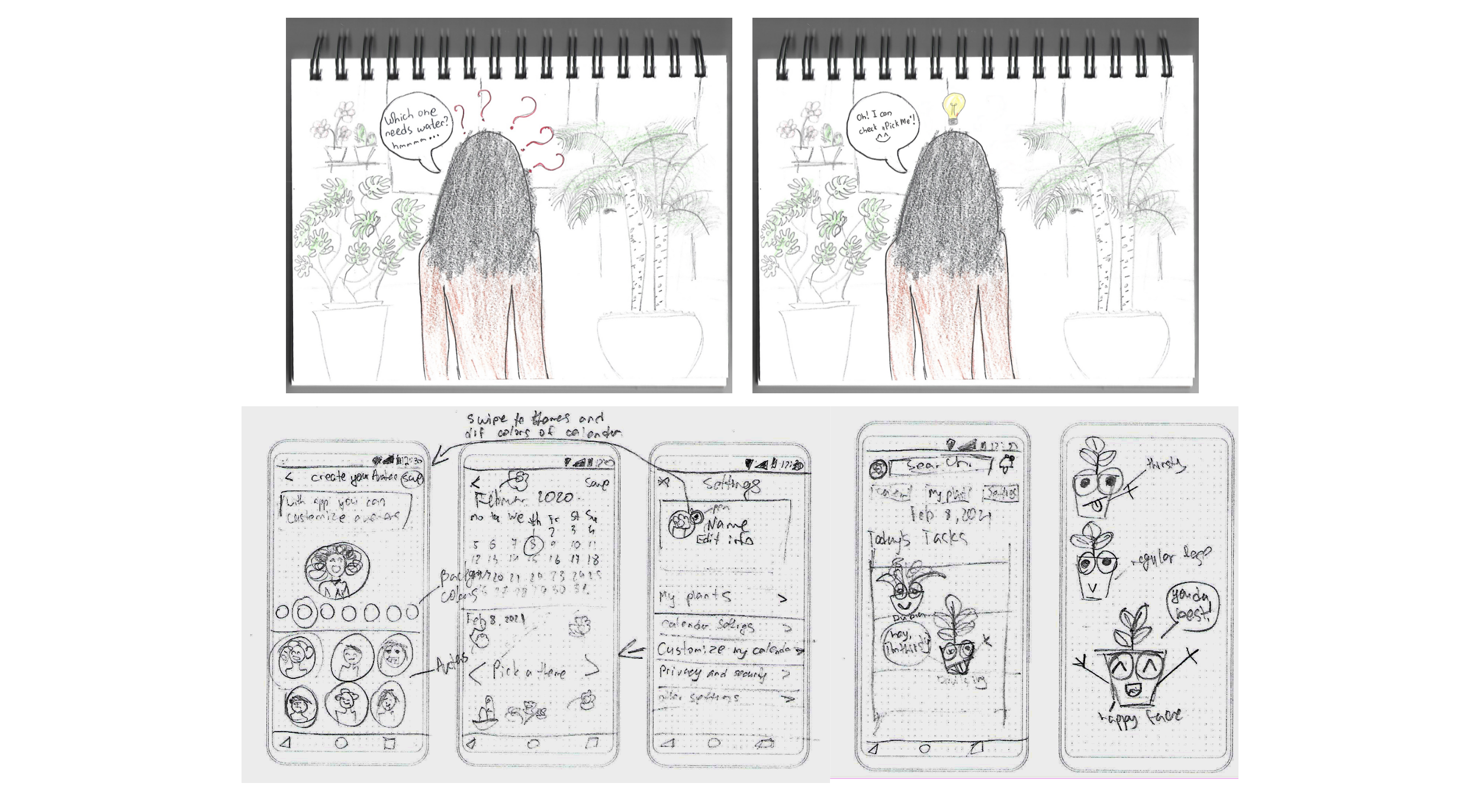
Those are some of the sketches that I did
This is our onboarding flow. we wanted it to feel as welcoming as possible. So, we went with a text message style screen that would guide our users through the process.

We went through several iterations of homepage before we took it to our users for testing, because we wanted to display all the essential information on the screen while keeping with the design goals, we set for ourselves.
First version, was a little bit too simplified, it was lacking a lot of the essential features, second version was packing way too much information on the screen.
We liked version three but it didn’t have the fun factor that we were thriving for, So we landed on or final version of the shelf view I was mentioning earlier, it displayed all the critical information but still remained very fun for our users.

Avatar customization was the key for us because we wanted to make sure our users were engaged throughout the process and feeling fun throughout the use.

This our plant care flow, when users land on their homepage, and they see a plant that needs watering, they would click on the plant see some details about status and be able to water it.

User testing
We tested these wireframes with five users, and got a lot of great feedback from them, to take into our high-fidelity prototype.
For the onboarding flow we learned that users really appreciated how welcoming the flow felt but weren’t quite certain about what the process was leading them towards. Some of the things we noticed was that the wording used in some of our buttons was very vague. We also found that the Create Account was kind of abrupt for users, it was a weird spot in the process.

We learned through testing so we took all this information, and adjusted our Design.
Here’s a view of the iterations we made
We gave users much more context by adding success messages and more informative coaching screens with visuals. We also relocated that Create Account step to the beginning so that users could get that out of the way, very quickly. And we also specified some of the button language just to make it clearer.

Next, some of the feedback we got on our homepage was that the navigation could be more simplified. Users, also felt that the shelf layers, maybe indicated something like urgency or difficulty, which we hadn’t thought about.
So, with this in mind, we just made navigation two buttons that users can toggle between, a shelf view, which is my plants and a full calendar view, if users ever needed a full picture of what their month will look like. We gave the shelf view a bit more intentional hierarchy, by putting all the urgent tasks up at the top and increasing the scale of those as well.

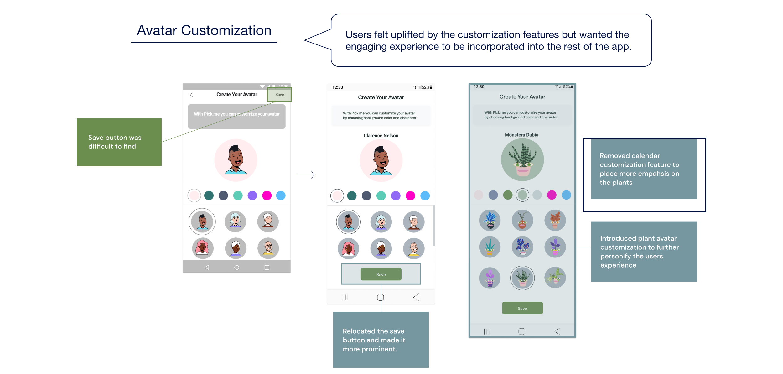
Avatar customization got a great feedback from users. They liked how fun it was, so we wanted to keep that going. We made some slight adjustments with the save button to make it more prominent.
We also decided to move forward with plant avatar customization instead of calendar customization feature, because we really wanted it to be as plant oriented as possible.
Regarding, plant care flow, users weren’t sure if they had accomplished the task. So, we throw in a few more visual cues to let them know they have watered their plant and they could exit.

Style guide and hi-fidelity prototype
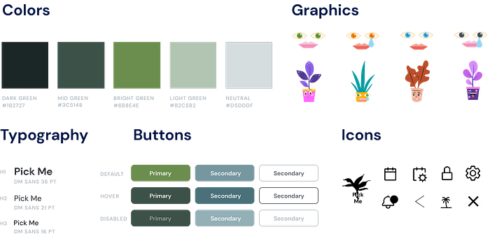
A little about our style guide. We had very bright, bold graphics in the app, so we decided to keep the colors and typography, very simple to keep a good balance.
High fidelity wireframes
This is what the process would look like they create their account.
They would let us know whether or not they were a plant owner, then take photos of their plants to identify them and tell us the most recent water date. Once they filled in all this information, we would ask to allow notifications so that they won’t have to return to their app.

Here’s the avatar customization
We wanted to keep the bright colors and fun avatars for plants and for users, so we tried to keep the two as consistent as possible.

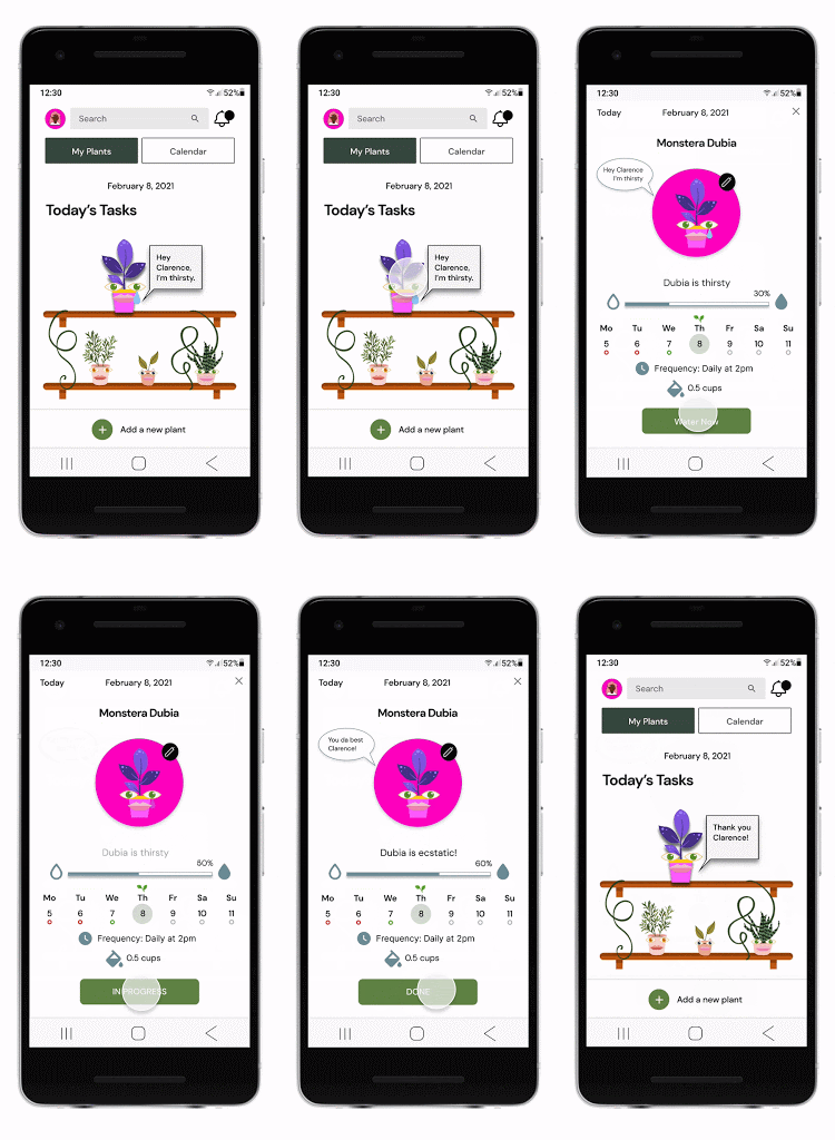
Lastly, our plant care flow.
Users, would click on their plant that’s thirsty and water it, and it would be extended. They click Done and return back to their shelf.
Final thoughts and next steps.
It is not debatable that the user research is the key, to any solution. Keeping this in mind I will continue to test and iterate on user feedback. My mantra for design is test it-iterate it-test it again.
And Last but not least I went a little extra and created this claymation to demonstrate Human-Plant relationship and dependance on each other.

